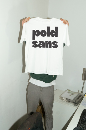
Vertiefungsprojekt Schriftentwurf «Pold Sans»

Vertiefungsprojekt Schriftentwurf «Pold Sans»
Simon Hofstede
| Set-Titel |
|
| Projekttitel auf deutsch |
|
| Projekttitel auf englisch |
|
| Untertitel |
|
| Autor/in | |
| Beschreibung |
|
| Beschreibung auf englisch |
|
| Kunstgattung / Disziplin | |
| Typ | |
| Bereich ZHdK | |
| Datierung |
|
| Dozierende/Projektleitung |
|
| Weitere beteiligte Personen |
|
Hervorgehobene Inhalte
10 Inhalte
- Seite 1 von 1

Vertiefungsprojekt Schriftentwurf «Pold Sans»

Vertiefungsprojekt Schriftentwurf «Pold Sans»

Vertiefungsprojekt Schriftentwurf «Pold Sans»

Vertiefungsprojekt Schriftentwurf «Pold Sans»

Vertiefungsprojekt Schriftentwurf «Pold Sans»

Vertiefungsprojekt Schriftentwurf «Pold Sans»

Vertiefungsprojekt Schriftentwurf «Pold Sans»

Vertiefungsprojekt Schriftentwurf «Pold Sans»
Vertiefungsprojekt Schriftentwurf «Pold Sans»

Vertiefungsprojekt Schriftentwurf «Pold Sans»